These are locations that report 3 or more Corona Related Deaths. Only 1 of these 28 locations has their Daily Growth rate under 30%. Medical supplies are desperately needed at these locations.
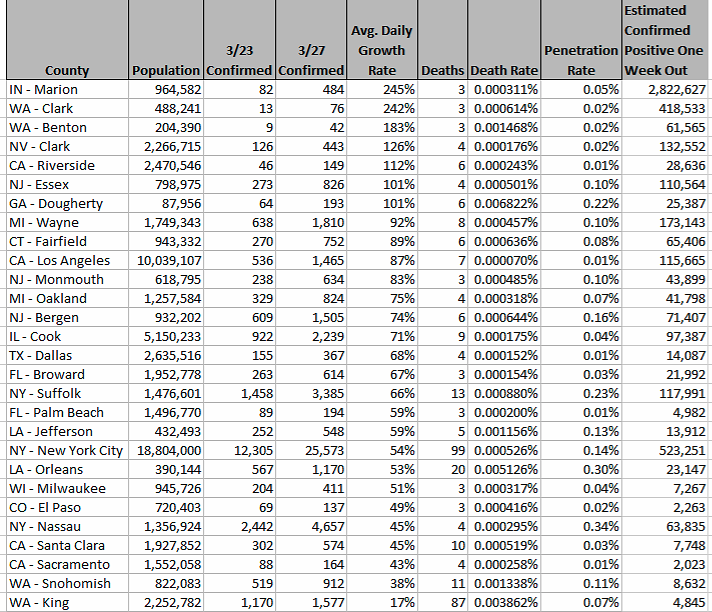
Average Daily Growth Rate= ((3/27 Confirmed Cases – 3/23 Confirmed Cases)/(3/23 Confirmed Cases))/Days Elapsed
Estimated Confirmed Positive Cases One Week Out = 3/27 Confirmed Cases * (1 + Average Daily Growth Rate)* (1 + Average Daily Growth Rate)* (1 + Average Daily Growth Rate)* (1 + Average Daily Growth Rate)* (1 + Average Daily Growth Rate)* (1 + Average Daily Growth Rate)* (1 + Average Daily Growth Rate)
Note: The average daily growth rate will slow before exceeding the max population. E.G. IN-Marion will not continue at the experienced average 245% daily growth rate.
The Transcript of the Video Follows:
Kitty Kurth (KK): Good morning! Today we’re here with Lee Neubecker from Enigma Forensics. A renowned data analyst, computer forensics expert, and inquisitive mind. Lee’s been thinking about the corona virus and looking into data. The data that’s out there in the world and taking it in, and looking at how we can analyze this data and what we can learn from it. Lee, tell us about what you’ve been doing.
Lee Neubecker (LN): Yes well, like everyone else I’ve been holed up at home in my basement and I’ve been wanting to think about, what can I do to help impact positive change, and what can my team do. And we decided we wanted to use our time to help minimize the spread of the virus and to help minimize death, so that’s my new mission that gives me something to wake up for and do, because certainly in the short term most client work is on hold because the courts are closed.
KK: So what, yesterday you released some data, can you tell us about where you got the data, what it was, and what it means. What you did with it, what it means.
LN: Yes, well like everyone else, I’ve been looking at the John Hopkins data map and they have a really nice visualization tool that lets you see the data as it’s updated. And I was examining their site and I discovered they had a GitHub repository where they’re uploading every day around 7pm central time. And as I looked at the data, I thought, you know there’s some interesting things that probably could be done that aren’t happening yet, such as looking at the penetration rate. If the county data just became available of the reporting, I looked out at the census and found some data from the census that included the population by county. So I started mapping out the population by county so that I could come up with something that I’m calling penetration rate. Which is essentially, what percent of the population has tested positive for the virus. And that information’s useful because it can give us some idea of, you know, how saturated will things be. Unfortunately though, the testing kits aren’t widely available so, it’s difficult to know for certain what’s happening as it relates to testing. More telling though is the data relating to deaths of corona virus, and that’s something that I was looking at this morning. And it has some, you know, really interesting things to talk about.
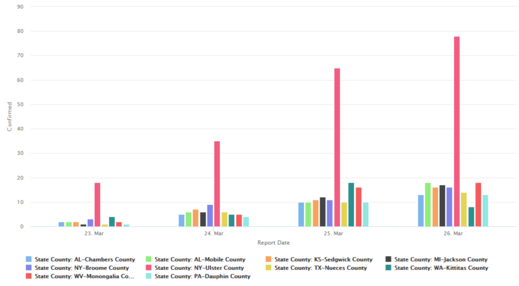
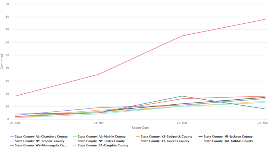
KK: What did you find when you were looking at that data? And the data you released yesterday, didn’t it show that there are 10 counties that are particularly in dire straits, or will be in dire straits, where the county officials should telling everybody to stay home.
LN: Yeah here’s my data model, are you able to see that? On screen, great. So, what I did is I thought, let’s look at locations that have 10 or more positive tests, and have, what are top 10 locations with 10 or more positive tests, that have the greatest rate of daily growth. And those are areas that no one’s talking about right now but I thought it was important to talk about that because they may think they’re safe. They may not know that someone’s begun passing the virus in the community. And so, you know, I identified places like Jackson, Michigan, which isn’t too far from where my family members are. They may not know there that they have a problem. They may not have public health professionals like Cook County has, dedicated to looking at the data. So, I thought it was important that we get the word out to some of these communities, that they’re emerging very fast with their growth of corona positive tests.
KK: There were some new data that you looked at last night, and some new things that you found, what did you find today?
LN: I wanted to look at where are people actually having deaths reported. So I looked at, where are there three or more deaths in the US. And because the tests are less reliable, you know, the confirmed test because there aren’t enough tests out there. But the places where people are actually starting to die, those are the places that are going to need a lot of medical supplies and help. And so today I published a new list of 29 locations. Let me resort this here by death rate. And death rate is a calculation, you know, how many deaths relative to the population. So for instance, in Dougherty, Georgia. They have the highest death rate, which may mean they’re in dire need of medical supplies. But they’re a very low population area.
KK: Georgia is one of the places that nobody’s been talking about at all. LN: Yeah and you can see there that, their population’s 87,000 roughly. They’ve had six deaths, but in terms of death rate, they’re at the top of it. So, you know, the public needs to look at what’s going on there. Are they keeping their kids at home? Are schools still open? Now those are important questions. Are people cavalier about it? You know, what’s the characteristic of the people who passed away? Are they all in a nursing home? There’s a lot of other things that can be looked into here. KK: Is there a cluster, are they all in one place? Or are they people that are out circulating in the community?
LN: Exactly.
KK: Is one of them the letter carrier? And then Louisiana has a high death rate and we heard about the fact that there are numerous cases there. Washington State it looks like is also high. New York, New Jersey. Connecticut is really growing it looks like. But then Colorado, no one has talked about that this one county in Colorado, El Paso County seems to have a really high rate. And Milwaukee, Wisconsin. People aren’t really talking about that either.
LN: If you look at Cook County, Illinois. What this is showing in my opinion is that despite the fact that we have a lot of cases, our health care system is keeping up, and keeping people from dying. So, you know, looking at how LA’s performing, what’s LA getting in terms of resources, and what’s the quality of their health care versus Dougherty, Georgia, or King, Washington, or some of these other places. You know, it’s very disheartening for instance to see Dougherty, Georgia, they’re at a 71% increase in testing over just a few days. That’s a average daily increase. They’ve actually, you know, more than almost tripled in just a few days.
KK: And again, that’s something that at least in the national media, no one is addressing Georgia. So, you know, we don’t know. I hope Georgia realizes they have a problem but no one else has talked about the fact that Georgia has a problem.
LN: The White House did say yesterday, that they wanted to try to address the counties where the hotspots are. So these are the hotspots. Some would say we should be doing this at the state level, and not focusing just on the county. But these counties definitely need attention.
KK: These counties need attention but what I heard the White House also say was, “we’re going to let counties be free if they’re not affected, then they can open up for business again.” And I don’t know about other states but here in Illinois, people go across the Cook County, Lake County, Cook County, DuPage County, Cook County, Will County borders pretty frequently. And sometimes several times in a day. So I don’t see how a plan to let places quote open up for business on a county by county basis could be helpful.
LN: Yeah but, you know, one of the things that I’ll be looking at as I update data. We’ll be looking at what’s going on in these counties. Are they sending alert out to people? If people aren’t aware that they’re having a daily increase of 128%, like Marion, Indiana. Their increase rate is alarming, 128%.
KK: And I don’t know about today, but historically Marion has been a place with a lot of manufacturing, and if people are working side by side in factories, that could be a huge problem. Thank you very much, and we’ll put up another post tomorrow and the next day as more data becomes available. Thank you Lee Neubecker and Enigma Forensics.
LN: Thank you.