
Is fear holding us back from moving forward?
Where do you stand? Shelter in place or open up! Is fear holding you back? If you don’t know what’s going on in the world today apparently you have been living under a rock. It seems so long ago when Enigma Forensics Lee Neubecker and Geary Sikich, President of Logistics Management Systems warned of what was to come and further outlined what would be the global impact. Enigma Forensics started posting our first post about COVID-19, Coronavirus: The Global Impact was on March 6.
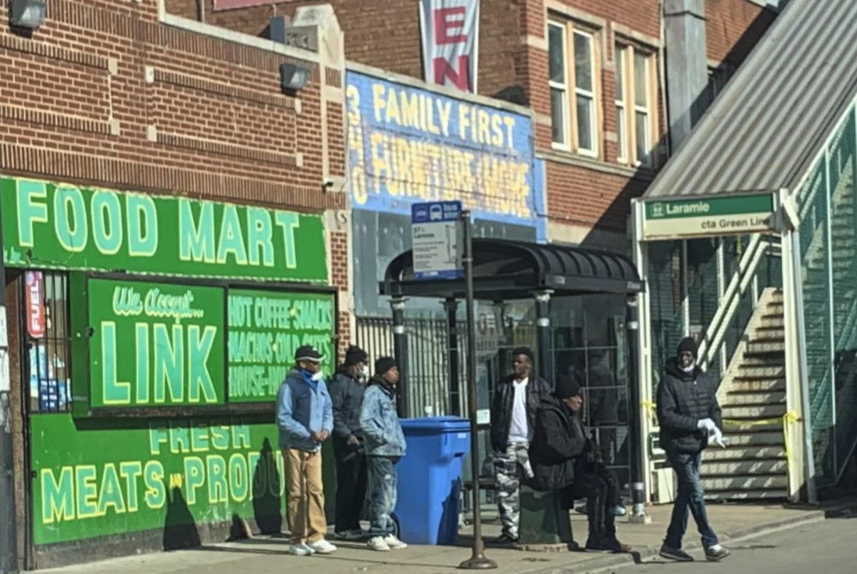
Mayor Lightfoot announced today that Chicago will not be able to open restaurants for outdoor seating on May 29. It’s different than what the state has outlined. As stated by the City of Chicago, we will be following “Protecting Chicago” framework. The City will be using this guide to govern Chicago’s reopening process amid COVID-19. The framework – organized into five phases in alignment with the State of Illinois’ “Restore Illinois” plan – will advise Chicagoans on how to safely exit from shelter-in-place while continuing to prioritize the health of our most vulnerable residents.
Did we anticipated COVID-19 spread to the U.S. to wreak havoc like it has? Absolutely not. Even though this is a play book that has never been written before, Lee Neubecker drew upon his cyber forensic skills and made it the company’s focus to track information on the rise of positive cases and deaths. Our intention was to save lives!
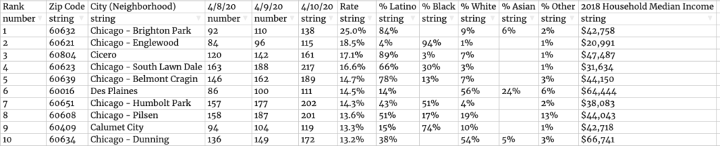
Illinois is now ranking third for COVID-19 cases behind New Jersey (#2) and New York (#1). According to the Illinois Department of Health, as of 5/21 Illinois has (102,687) Positive Cases and (4,607) Deaths and (672,723 ) Tests performed. Over all, according to the Center of Disease Control reports, the US has (1,581,903) Positive Cases, (93,806) Deaths, and (301,341) Recovered Cases.
Education trumps fear. Wear a mask and wash your hands. Based on these numbers, where do you stand? Stay in shelter in place or open up?
It started when…CDC: Center for Disease Control announced first COVID-19 case in the United States. Jan. 21.
https://www.cbsnews.com/news/coronavirus-centers-for-disease-control-first-case-united-states/